Whether through mobile phones, tablets, laptops or desktops, we undoubtedly access the Internet today from all kinds of devices. Consequently, we have the need to create web design with user experience with Bootstrap for the companies that hire us.

Our web design agency, AppDesign, prioritizes correct display on mobile devices and high customer conversion to your website. Remember, Mobile First is the key to achieving quality design and a high user experience.
To achieve a high conversion rate and a high range of user experience, web page designs have to be custom developed and the best tool for this is Bootstrap.
Read on and learn how to achieve such format adaptability by development of web pages and apps with Bootstrap.
What is Bootstrap?
The expression boot strap is usually translated literally from the English as "boot strap" or "shoe tongue", that is, that strip generally made of leather that is placed in the back of a shoe and that, by pulling it, helps to place the foot inside the shoe or boot.
From this image of "lifting oneself off the ground by pulling on the tongues of one's shoes", a certain metaphor of a "self-sufficient tool" or rather in terms of computing, a "set of tools and procedures for an environment to build itself", can be imaginatively deduced; hence also bootstrap is sometimes translated into Spanish as "startup sequence" o "startup sequence."
However, Bootstrap no translation needed because it's the name of one of the most popular frameworks or standardized set of HTML, CSS and JavaScript tools, which programmers use for free to develop so-called responsive web designs or adaptive to any device; but starting first from a mobile project rather than a desktop one.
Of course, there are others frameworks by design responsive,such as MaterializeThe new website, Foundation or Pure.css, is also useful when resizing the elements of the website so that they automatically adapt to the width of each device, thus providing a correct display of the same content and a user experience as similar as possible despite the differences of each format.
Custom development with Bootstrap
But Bootstrap, since before its current version 3.3.6 and already close to its version 4, is a framework designed to program web environments responsive, under the umbrella of mobile-firstThat is, first and foremost to design with mobile devices such as cell phones in mind.
This approach is based on the fact that since mobile devices have a much smaller screen and therefore a more limited touch usage than those of a desktop computer with its mouse and 17-inch screen, then it is easier to program the responsive design of a web page in this unfavourable situation and then adapt it to the more favourable one, than to do the opposite.
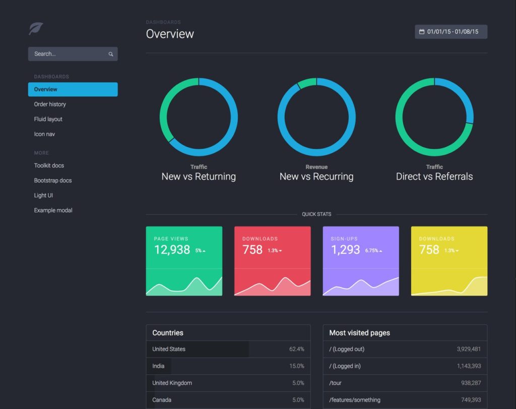
Originally developed by Mark Otto and Jacbod Thornton from Twitter, Bootstrap consists of a collection of interactive templates for CSS ("Cascading Style Sheets") and HTML ("Hypertext Markup Language"), design templates with typography, buttons, tables, forms, navigation menus, image carousels and other add-ons that one can use in the development of its website and mobile app.
Also Bootstrap incorporates several plug-ins, auxiliary functions or JavaScript extensions, which allow you to very quickly layout an incredible front-end Useful, even for those developers with basic knowledge of programming front-endIn addition, it uses semantic structure of the content, of coding the design in style sheets and, above all, of interaction with the user.
Released by Twitter since August 2011, Bootstrap It is open source, so developers are invited to participate in the project by making their own contributions to the platform. It is also available on GitHub, where it is the most popular project since February 2012; being used by NASA and MSNBC, among other organizations.
Advantages and Disadvantages by Bootstrap
- Easy and intuitive to operate: For example, when doing web layout with Bootstrap, a user interface, you don't waste time modifying the CSS to make a view with 3, 4 or 5 columns. Also, we can add a clearfix or make structural changes at the request of the client that they wish to see live and direct.
- No more Hacks: Since each browser mysteriously implements HTML, CSS and JavaScript in a different, multiple and non-standardized way, it is annoying to get our responsive design looks identical in all browsers. But Bootstrap eliminates these frustrations by making sure that what is designed does look consistent across all browsers and mobile devices.
- Ideal for mobile devices: Like we said, Bootstrap is a framework primarily optimized to create, using CSS rules, responsive web pages. Responsive web pages automatically and dynamically adapt to the vast majority of screens and resolutions on the mobile market. When we are asked for a responsive designlet's easily solve it with Bootstrap: see some examples created with Bootstrap.
- Twitter maintains and updates it: As it was developed as an internal tool for Twitter employees, this company decided to share it with the world and ensure its preservation and updating through open source. It is not a framework development projects like Laravel or Codeigniter for complex projects, but most of the heavy work of your programming it's done.
- It's expandable: As it is an architecture for software or program that allows to start another bigger program, Bootstrap gives us the tools and procedures to extend and adapt the framework according to our needs, so it does not limit in any way the designs one can make.
Conclusions
- It's not for beginners: One cannot use it if one does not at least have knowledge of programming Otherwise, we run the risk of not only feeling overwhelmed by the amount of stuff that comes at us at once (we're talking about a stylesheet of about 6000 lines), but also adopting bad CSS practices because Bootstrap it's perfect.
But having some basic knowledge in HTML and CSS, in a couple of hours we will have our first hopeful results and, once the first project is finished, that feeling that we already have the reins of the horse.
- A large fingerprint: Between 200 and 250 KB in CSS and JavaScript files is the fingerprint of Bootstrap if you use it as offered on their download page (www.getboostrap.com); which is quite large and heavy and therefore problematic to use if you live in a Latin American country where internet bandwidth is generally slow.
- Too many conventions and nested nodes: To show an alert, it is not necessary to create 3 divs, at least ideally. Well, when one programs with Bootstrap we realize that creating such alerts, forms, media objets and other things, it means adhering to both the conventions of the framework that we end up with a more complex and less semantic DOM.
- When JavaScript is disabled, most Bootstrap sites do not work: Ideally, a website should work today if JavaScript is disabled, but many programmers don't think about users who disable this interface when developing a web design in Bootstrap and, in case of deactivation, such environments front-end don't look good or are not very accessible.
Web development services with Bootstrap
Still, our web design agency, uses the web page programming in Bootstrap. Some if you don't have the time or energy to be debugging the CSS. Like everything framework, Bootstrap provides us with a quick and easy way to implement web designs. It ensures that this design works on a wide range of browsers and that its code meets certain standard rules. Why hesitate to download it?
If you have any questions, you can consult our team of developers with Bootstrap through the budget form:


